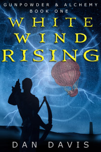
I’ve updated my covers for Gunpowder & Alchemy.
Here’s the latest version of book one, White Wind Rising:
For reference, here’s the old version:
Not massively different but strangely the downloads per day have gone down since I changed it… interesting. There are so many variables with cover design, it’s hard to know what will resonate most with people.
What do you think, is the new cover better or worse than the old one?


Mostly I like the original cover. The new cover treatment for your name and the series name is better–cleaning it up. But in the original, the book title is better and the fuzziness and light-blindness is a nice eye-catcher. The edges are a bit too clean to look coherent in the new cover, in me humble O.
Awesome thanks so much for the detailed feedback, I very much appreciate it! Good stuff.