Things that we know about book cover design:
- Everyone judges a book by its cover.
- Good covers sell books.
- Indie publishing is full of bad book covers.
- Unless you are an actual designer as well as an author, never design your own covers because they will suck.
- I am not an actual designer.
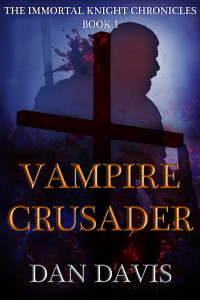
- I designed my own covers.
Before I had a bash at it, I did a fair bit of research into what you should consider when designing a cover. There are plenty of tutorials and guides out there but many are contradictory or confusing so I have put together a list of key pointers.
I am assuming that you do not want to hire a designer or you do not have someone who can make one for you. It might be that you can’t afford it or it’s not worth it to you. Or, perhaps, like me, you want to have a go because you’re artistic, a quick learner and you love this sort of thing. Whatever the reason is, you just want to know how to make an eBook cover Remember, though, if you’re not enjoying it or it’s taking you away from your writing for too long then it might be worth finding that person who’ll do it for you.
What follows is an amalgamation and summary of uncounted blogs, tutorials, videos and guides plus my own limited experiences.
What software should I use?
Photoshop is the industry standard and many tutorials assume you have it, which can be annoying because it costs a fortune. If you cannot afford Photoshop then use free alternatives such as:
- Canva is super simple but somewhat limited. Great if you don’t want to spend much time but want a neat, attractive image
- GIMP is pretty much as good as you can get with a free image editor.
- You can even use Word to create an image. The main thing is to remember the design principles
Where do I get photos and images from?
You do not need to be an artist and you do not need to draw pictures to create a cover. Instead, find photos online, then mess with them.
Find royalty free photos at, for example:
- Fotolia
- Pixabay
- And/or use Google image search and filter by commercial use.
- You can find thousands of incredible landscape photos but good photos of people are harder to find.
- You can get free photos and images but those sites reserve the best, most professional images. Those you have to pay for but they’re not hugely expensive (or they shouldn’t be). You’ll have to decide if it’s worth it (if it makes a good cover, it’s probably worth it).
Where can I get some cool fonts?
Find royalty free fonts at a whole bunch of places:
Remember to get commercial use fonts and also that a lot of these are kinda amateur-quality. It’s tough to make a quality font and a lot of the time the space between the letters (we experts call it “kerning”) sucks. Generally speaking, the simpler the font the better it will look.
- You will read that your title should be legible in thumbnail size. But there is no good reason for that. Look at great covers and see how many follow this supposed rule.
- Quality text on the cover can be the single element that separates the amateurs from the pros. Getting the type wrong stands out a mile.
- Keep it simple. Use Ariel if you have to rather than something illegible and crazy.
- Don’t add massive drop shadows and bevels and crazy patterns (I break this rule. Man, I love dem bezels tho).
How big should my cover be?
I’ve seen a lot of different advice on pixel size and ratios.
- Ratio:Amazon suggests 1:6 but that looks a bit narrow and 1:5 looks better.
- Pixels: generally, the more the better. It’s easy to scale down but hard to scale up. I used something like 4000 x 3200 which is pretty huge but I’m sticking with it. Just keep whatever you do within the pixel size and file size within the guidelines of whatever you’re uploading to.
Have you got any other tips on ebook cover design?
Why, yes!
- Keep it simple
- The cover should reflect the feel of the book rather than trying to recreate a particular scene.
- Covers with people on them sell better than those without (even a tiny or faint outline of a person). Allegedly.
- Don’t worry about the person matching exactly the characters in the story. The idea is to grab attention and give the right feel of your story rather than be accurate.
- Think about colour and tone as much – or more – than composition and content. When people scroll through thumbnails the detail is lost but those stand out.
- It should be similar to the other books in your genre. Research the bestsellers.
- Use the genre conventions for image content (Romance = sixpack. Fantasy = dragon. Sci-fi = spaceship).
- Use the genre conventions for colour (Romance = black. Fantasy = green. Sci-fi = blue and white.)
- It should stand out from the other books in your genre (by being better then the others)
- Fiction and non-fiction styles are very different but the elements of good design remain. Keep it simple.
- Do not be afraid of blank space on your cover.
- Keep it simple
Remember that maybe I don’t know what I’m talking about because I have only made those four covers and you might think they suck. If you do, I think the advice above still stands and it’s just that I didn’t follow my own advice. One series style is middle grade fantasy and the other is historical horror fantasy. Hopefully you can tell the difference.
Anyway, I will continue to improve these covers and those for my future books. I really enjoyed making these and I look forward to making more. I could do it all day long, I love it. I was making these thinking, yeah, man, I could totally do this not just for myself but for other writers too!
On the other hand, if I was rich I think I’d still get a professional to do them for me because I want to be writing and they’d sell more books. Maybe.
If anyone is thinking of doing their own covers or would like to know more, let me know in the comments or email me. Likewise, if I missed anything from my list that you think needs to be on there, please tell me.


